Chapter 7 of 13 · Intermediate · 8 min read
How to Grade Skin Tones with the Vectorscope
Viewers forgive a sky that is a little too blue or a wall that is the wrong shade of grey. They do not forgive skin. We look at faces more than at anything else in a frame, and we know from a lifetime of looking what healthy skin is like, so a few degrees of green reads as illness and a little too much orange reads as fake tan. Skin is the colour that tells an audience whether to trust the rest of the grade.
The good news is that skin is also the easiest colour to measure. Almost every complexion lands close to one line on the vectorscope, and faces fall in predictable places on the waveform. This chapter shows how to read both, how to fix the common casts, and how to keep skin believable when you add a strong look on top.
It builds on reading video scopes and secondary colour correction; if the vectorscope or a qualifier is new to you, start there.
Video guide
How to Correct Skin Tones with the Vectorscope Skin Line
Chapters
Why skin matters most
Psychologists call skin a memory colour: a colour we judge against an internal reference rather than against what is next to it. Grass, sky and skin are the big three, and skin is by far the strictest. You can grade the background teal, the sky orange or the whole frame black and white and the audience follows along, but the moment faces drift towards green or magenta, the picture looks broken.
That is why experienced colourists check skin first and last. Get it right in the primary correction, protect it while building the look, then check it again before export, because almost every creative move pushes on it.
The skin tone line on the vectorscope
The Vectorscope plots every pixel by its colour alone: the angle round the circle is the hue, and the distance from the centre is the saturation. Brightness is ignored. A neutral grey sits in the middle, and the six small boxes mark where 75% colour bars land, so you can see red, yellow, green, cyan, blue and magenta round the edge.
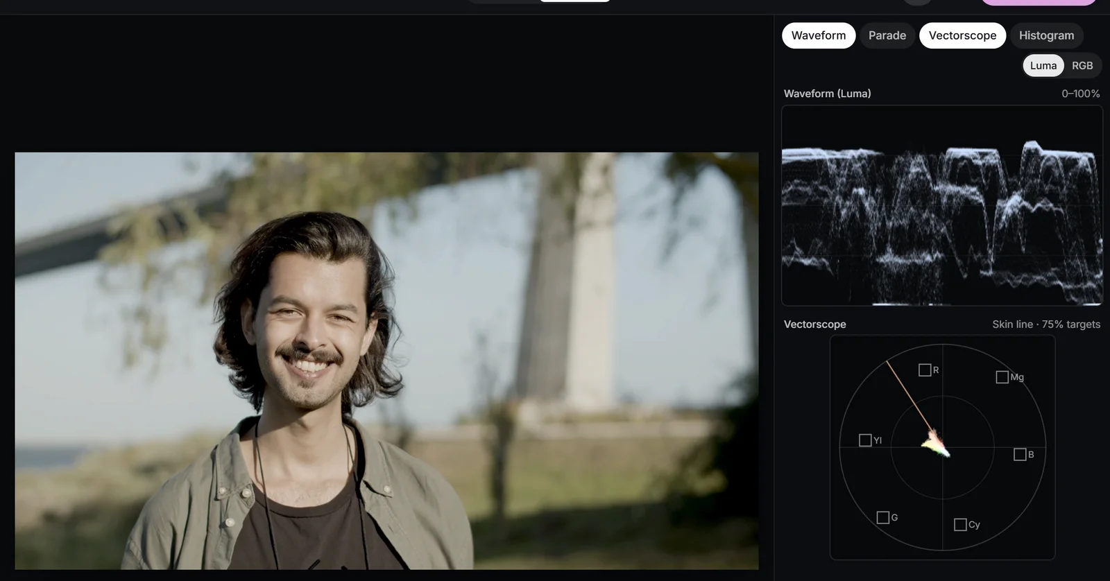
The skin tone line runs from the centre out between the red and yellow targets, at about 123° from the horizontal axis, or roughly the 11 o’clock position. Engineers will know it as the I-line of analogue NTSC, an axis originally chosen because it matched the orange-cyan direction in which human vision is most sensitive to detail. It has outlived NTSC because faces of every ethnicity cluster along it.
Why every complexion sits near the same line
The colour of skin comes mostly from two pigments: haemoglobin in the blood, which is red, and melanin, which is a brown that sits between red and yellow. Different complexions contain different amounts of melanin, which makes skin deeper and changes how saturated it is, but it does not swing the hue far. So light, medium and deep skin all point in roughly the same direction on the vectorscope. They differ in how far from the centre they reach and, on the waveform, in how high they sit.
 (enlarge image)
The face forms a cluster along the skin tone line, between the red and yellow targets.
Treat the line as a reference, not a law. A spread of a few degrees either side is normal; make-up, warm sunset light or a deliberate stylised grade can move faces off it on purpose. What matters is that you notice when skin has moved and decide whether you meant it. Because the vectorscope shows the whole frame, a red jumper or a beige wall can hide the face; isolate it with a soft window on a secondary layer, or check the Highlight view to see what you are looking at.
Reading skin on the waveform
The Waveform shows brightness from 0 to 100% for each column of the picture, so a face shows up as a bright cluster at its horizontal position. There is no single correct level, but as a rough guide for a normally lit shot, the lit side of fair skin often sits around 60-70%, medium skin around 45-60% and deep skin around 30-50%. The False colour view marks 60-66% in pink as a guide to bright skin.
- Don’t force every face to the same level. Lifting deep skin to where fair skin sits flattens it and greys it out; it should be rich, not pale.
- Look at the spread inside the face as well as its average. The gap between the lit side and the shadow side is the lighting ratio, and squashing it removes the shape of the face.
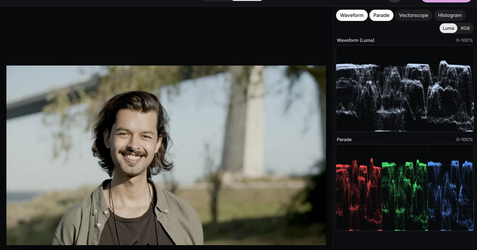
- Switch to Parade to see the channels. In natural skin, red is highest, then green, then blue. If green climbs level with red, the skin will look sickly; if blue climbs towards green, it will look grey and cold.
 (enlarge image)
In the Parade, natural skin reads red highest, then green, then blue.
Fixing magenta, green and yellow skin
First decide whether the cast belongs to the whole frame or only to the skin. If whites and greys are off too, the light or the camera’s white balance is wrong, and the fix belongs on Correction: Pick white on something neutral, then trim Temperature and Tint while you watch the skin on the scope (see white balance). If greys are neutral but skin is still off, the problem is the skin itself, usually because of mixed light, make-up or a light source with an uneven spectrum.
| Skin looks | On the vectorscope | Whole-frame fix | Skin-only fix |
|---|---|---|---|
| Magenta, flushed | Rotated towards red and magenta | Tint towards green | Skin key, small Hue rotate |
| Green, sickly | Rotated towards yellow and green | Tint towards magenta | Skin key, small Hue rotate |
| Yellow, jaundiced | Rotated towards yellow | Temperature cooler | Hue vs Hue towards red |
| Orange, fake tan | On the line, too far out | Less Saturation | Skin key, lower Saturation |
| Grey, ashen | Too close to the centre | Less cool in the grade | Skin key, a little Saturation |
For a skin-only fix, add a secondary layer, turn on Use qualifier and choose the Skin preset. Check the selection with Show mask set to Highlight, then use Hue rotate a few degrees at a time in whichever direction brings the trace back to the line. Small moves are enough: five degrees is a big change in skin. A Hue vs Hue curve with Pick colour on the face does a similar job without a mask, but it also moves every other object of the same hue.
Protecting skin from a look
Most creative looks push the warm and cool ends of the picture apart. Skin sits on the warm side, so a look that warms highlights pushes faces further out along the line, and one that cools the midtones drags them towards grey. Protect skin tones in the Looks panel solves this with a built-in skin qualifier: pixels that match skin are held back from the look by the amount you set.
- Start around 50-80%. At 100% faces can look pasted in, untouched by a light that has changed everything around them.
- It keys by colour, so orange objects near skin hue, such as wood, sand or a brick wall, are protected too. Usually that is harmless; if not, lower it and use a secondary instead.
- Skin under strong coloured light, such as a red stage wash, may fall outside the key. Check the vectorscope rather than assuming it worked.
To build the same thing by hand, add a secondary layer, choose the Skin preset and switch on Invert mask. The layer now grades everything except skin, which is a neat way to cool a background without touching the faces in front of it. It is a common way to build teal and orange in a professional grade.
 (enlarge image)
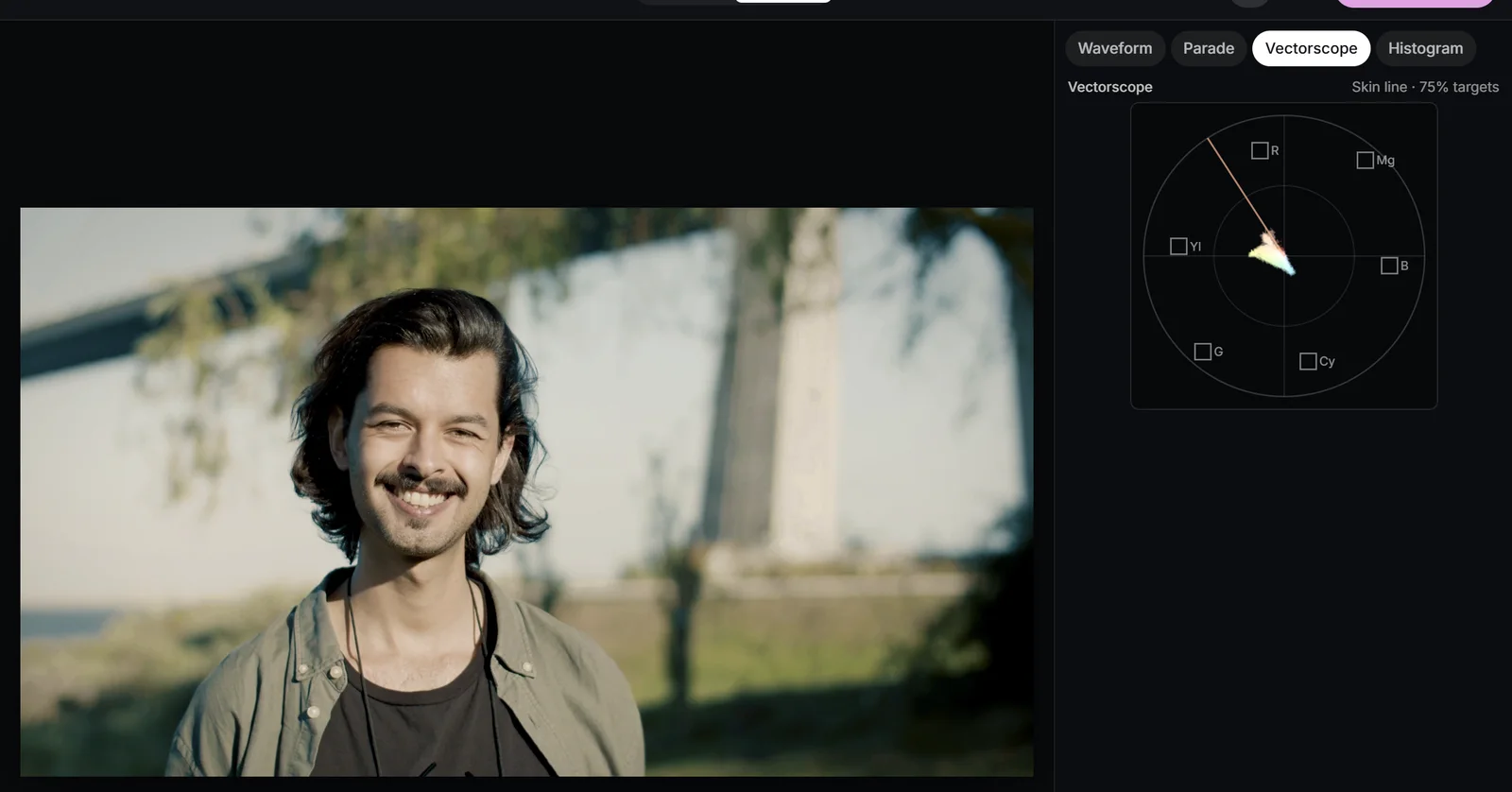
A strong look with Protect skin tones at 70%: the background takes the look, the face stays near the skin line.
A soft window to lift a face
On set, a reflector or a bounce card adds a little light to the face so it stands out from the background. A window does the same in the grade. Add a secondary layer, add a Circle, make it larger than the face and raise Feather until you can’t see where it ends. Then raise Exposure by a quarter to half a stop, or open up the face’s shadow side with Lift in Wheels while this layer is selected.
Keep it subtle. The audience should feel that the face is better lit, not see a halo following it. If the background close to the face is lifted too, combine the window with the Skin qualifier: windows and the qualifier intersect, so only skin inside the circle changes. The window won’t track a moving head, so keep it generous and check the whole clip.
 (enlarge image)
A soft Circle intersected with the Skin preset selects just the face, ready to lift.
Common skin mistakes
- Orange skin from saturation. Skin is already one of the most saturated things in an everyday frame, so global Saturation pushes it out first. Use Vibrance, which holds back colours that are already saturated, or see video saturation.
- Grey skin from a cool grade. A teal push that reaches into the midtones drains the warmth from faces. Keep the cool in the shadows and raise Protect skin tones.
- Judging on one screen. Phones and laptops differ wildly in colour and many shift warmer at night. The skin tone line is the same on every screen; trust it over your eyes when they disagree.
- One setting for every face. In a two-shot of different complexions, match their hue, not their brightness or saturation.
- Fixing skin before the primary. A skin secondary on an unbalanced frame chases a moving target. Balance first, then refine.
Try it: check and protect skin tones
Read a face on the vectorscope, keep it out of a strong look with Protect skin tones, and lift it with a soft window on its own layer.
- 1
Open the scopes
Switch to Pro and choose Vectorscope and Waveform. Find the face cluster and see how close it lies to the skin tone line.
- 2
Apply a strong look
In Looks, choose a teal and orange look such as Blockbuster at full Intensity, and watch the skin cluster move off the line.
- 3
Protect the skin
Raise Protect skin tones to about 70% until the cluster swings back towards the line while the background keeps the look.
- 4
Lift the face
Open Secondary, choose Add a secondary layer, add a large Circle over the face, raise Feather, then raise Exposure about a third of a stop.
- 5
Compare
Use Compare, Split and play the clip to check the face stays inside the window and still looks natural.
Drop a video or photo to colour gradeChoose a video or photo to grade
Opens in the studio: looks and Auto colour for a quick result, wheels, curves, masks and scopes when you want more.It opens in the studio on your phone. Nothing is uploaded.
MP4, MOV, WebM, MKV, JPG, PNG, WebP
Free · no watermark · graded on your device, never uploaded