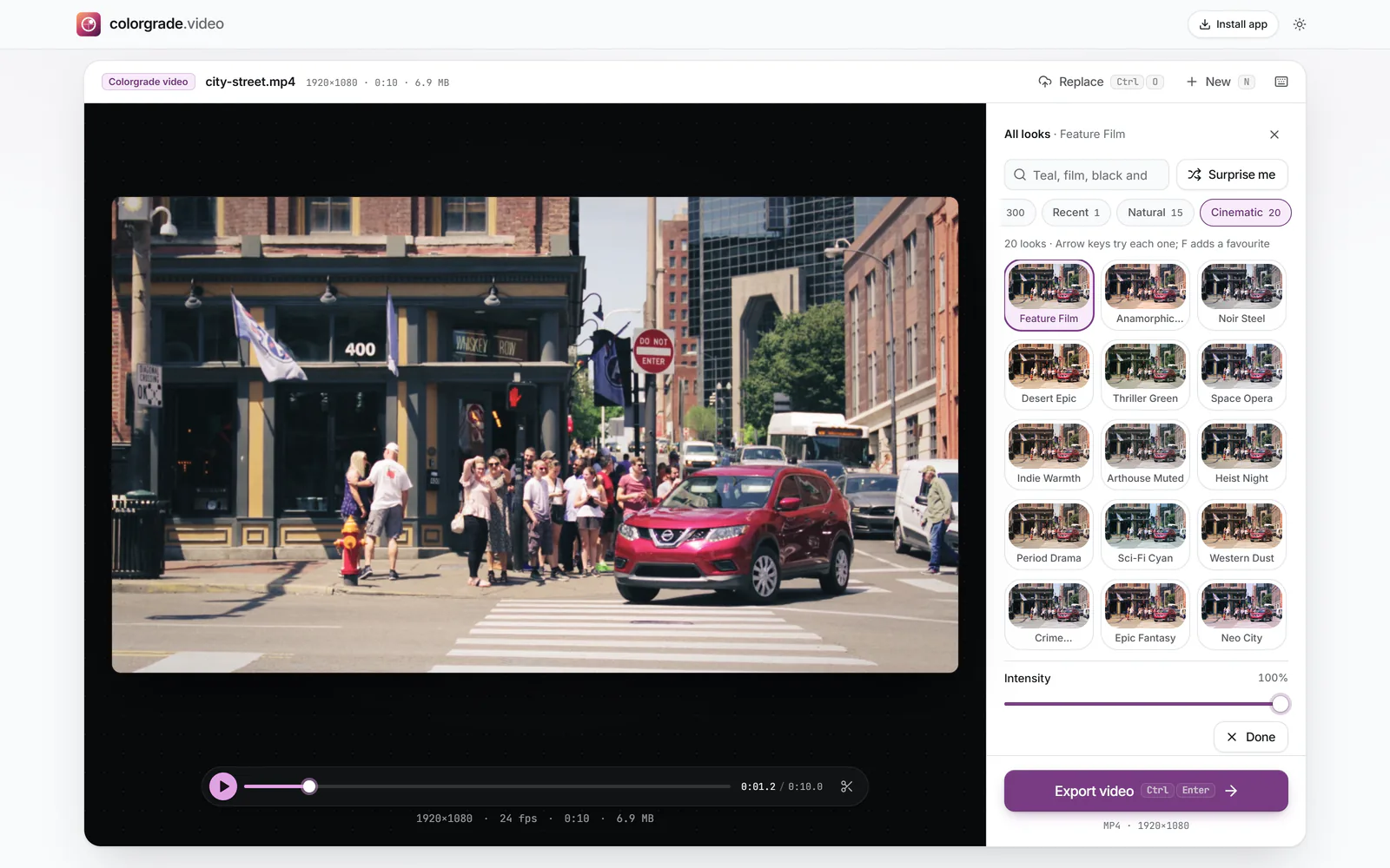
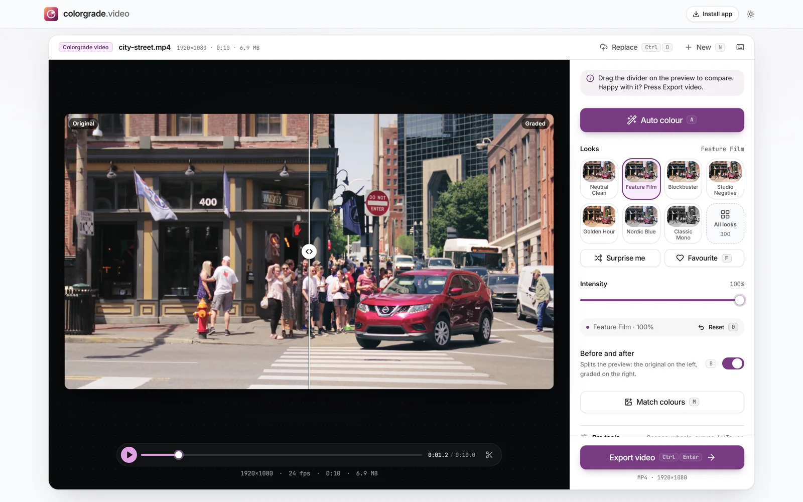
Audiences have absorbed a century of film prints and decades of digitally finished features, so they recognise the signature even if they cannot name it. Most of it comes from a few measurable traits rather than any single magic filter.
A soft toe and shoulder
Film negative and print never jump straight from detail to pure black or pure white; the response curves gently at both ends. Phone video tends to do the opposite, with crisp, sharply clipped highlights and contrast tuned to look punchy on a small screen. A cinematic grade rounds those corners: the deepest shadows keep a trace of colour and the brightest areas fade into white instead of snapping. Fade in the Basic tab and the shape of the Master curve on the Curves tab both control this.
A limited palette
Films are designed in colour. Production designers and costume departments choose a few related hues, and the grade then pulls stray colours towards them. That is why a restrained grade often looks more expensive than a saturated one: lowering Saturation a little and letting one or two colours carry the image gives the frame a point of view. The HSL tab lets you quieten a single distracting colour, such as a lime-green bin in the background, without touching anything else.
Separation by temperature
Many graded shots place cooler colour in the shadows and warmer colour in the highlights and on faces. Our eyes read warm as near and cool as far, so the subject seems to stand forward. Shadow tint and Highlight tint on the Effects tab add this split toning directly, and Tint balance decides where the shadow colour hands over to the highlight colour.
Texture
A clean digital image can feel clinical. A little Grain, a gentle Vignette that draws the eye inwards, and a hint of Halation round lamps and windows all soften that edge. Keep each one subtle: if someone notices the effect before the picture, it is too strong.