Chapter 2 of 13 · Basics · 9 min read
Contrast and Tonal Range in Color Grading
Before any colour decision, a grade needs a sound tonal foundation: where black sits, where white sits, and how the tones in between are spread. Colour depends on it. The same hue looks richer with deep blacks around it and duller in a flat, grey picture, and a cast is far easier to judge once the levels are right.
This chapter works on a deliberately flat version of the test chart, chart-flat, whose blacks are lifted and whose whites never reach white. You will set the end points, place mid grey, add contrast in two different ways and learn to protect the extremes, judging each step on the Waveform and in False colour rather than by eye. If the scopes are new to you, read how to read video scopes first.
Video guide
How to Add Contrast to Video: Black, White and Mid Grey
Chapters
What tonal range is, and why footage looks flat
Tonal range is the spread of levels a shot uses, from its deepest shadow to its lightest white. On the Waveform it is the height of the trace; on the Histogram it is the width of the hill. Contrast is how steeply the tones climb within that range: two shots can both run from 0% to 100% and still feel very different, because one spends most of its pixels in the middle and the other pushes them towards the ends.
Flat footage uses only part of the scale. Typical causes:
- Log or “flat” picture profiles, which store a wide range of light in a narrow, grey-looking signal on purpose. These need converting rather than stretching; see log footage and LUTs.
- Haze, fog, lens flare or a dirty filter, which add stray light to everything and lift the blacks.
- A range mismatch: limited-range video (black at code 16, white at 235) read as full range, which lifts blacks and dulls whites in exactly the way chart-flat shows.
- Soft, frontal light with no shadows in the scene itself. Here the flatness is real and may be the mood.
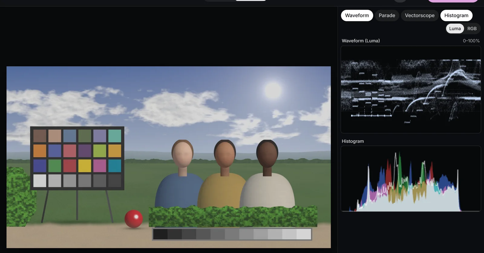 (enlarge image)
Flat footage on the Waveform: the scale is only partly used.
On chart-flat, the grey wedge’s staircase starts well above 0% and stops well short of 100%. The job is to stretch it to fill the scale without breaking the steps at either end.
Set the black and white points
The black point is the level that becomes 0%; the white point is the level that becomes 100%. In Adjust, Blacks and Whites move them. Lowering Blacks takes a level above zero and maps it to black; raising Whites takes a level below 100% and maps it to white. Everything between is stretched in proportion, so the steps of the wedge stay evenly spaced, just further apart.
Work on the waveform. Lower Blacks until the bottom of the trace just touches 0-2%, then raise Whites until the lightest true white, here the white patch of the chart, sits around 95-100%. Stop as soon as the trace starts to pile up in a flat line at either end: that pile-up is detail being merged into pure black or white.
Not every shot needs the full range
Fog, dusk and soft interiors genuinely lack deep blacks or clean whites, and stretching them to 0-100% destroys the atmosphere. The rule is not “always fill the scale” but “make the ends a decision”: a black that sits at 6% because you chose a softer look is fine; one that sits there because nobody looked is not.
Place mid grey, in linear light
Black and white are the frame; mid grey is the anchor. An 18% grey card, the average reflectance of a typical scene, lands at roughly 40-45% on a Rec.709 waveform. If the middle of the image sits there, faces, skies and most surfaces follow naturally. In False colour that band, 41-48%, is painted green, which makes placing it quick: open View, choose False colour, and watch the middle step of the grey wedge or a grey card in the scene.
The control for moving the middle is Exposure, measured in stops (-4 to +4). It works in linear light, as a camera’s aperture does: +1 multiplies the light in the scene by two, -1 halves it. Because the picture is encoded with a gamma curve, that multiplication moves mid and upper tones further on the waveform than it moves the deepest shadows, and black stays black. When you raise it, the studio rolls the lightest values off on a smooth shoulder instead of clipping them hard.
Where skin and other landmarks fall
- Pink in False colour (60-66%) is one stop over mid grey, a common level for light skin in good light.
- Deeper complexions sit lower, often near or below the green band, and should. Never push every face to the same number; check that skin keeps its texture and sits on the skin tone line instead. More in skin tones.
- Yellow (97-99.5%) shows tones about to clip: fine for lamps and specular glints, a warning on a white shirt.
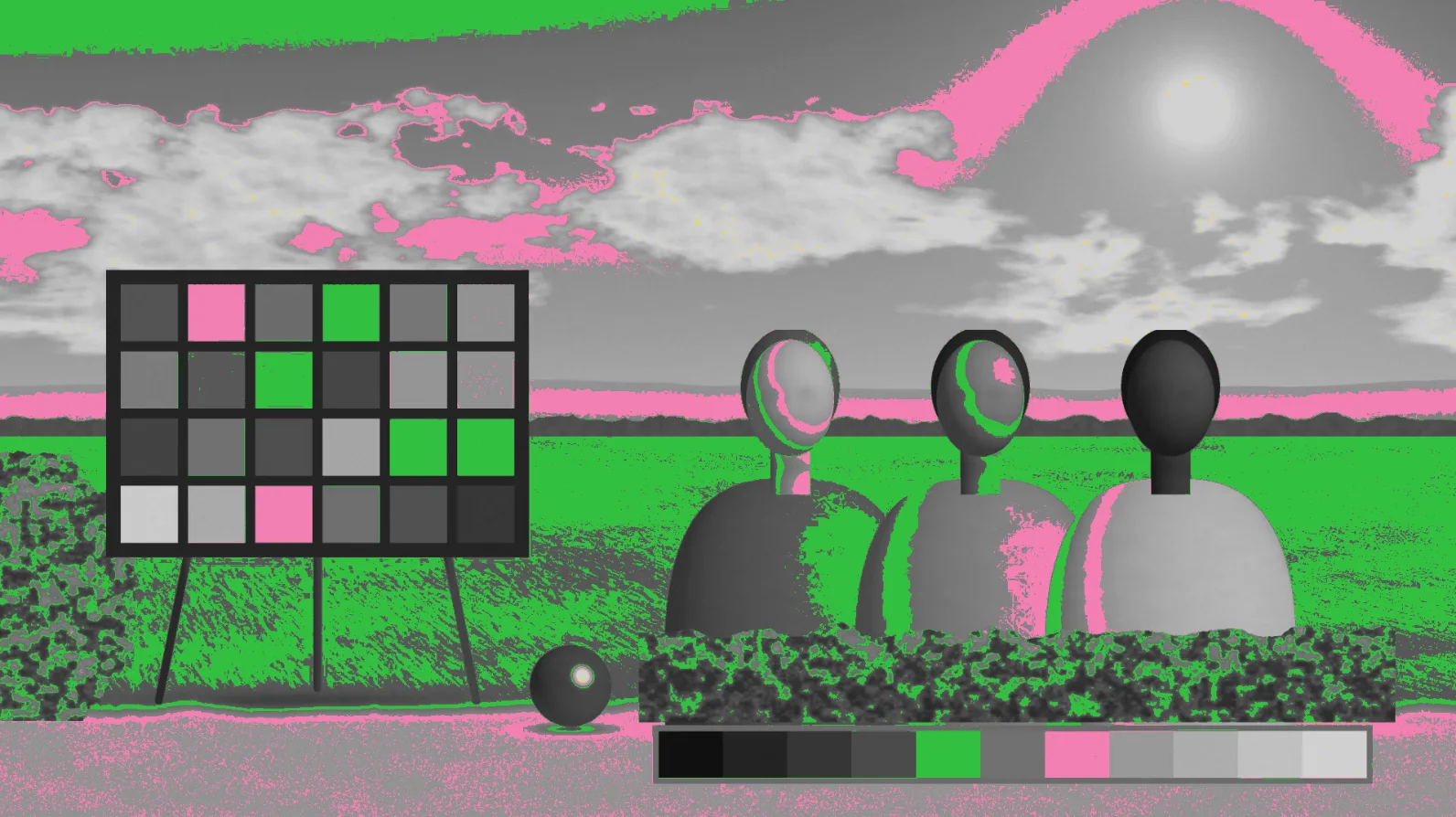 (enlarge image)
After setting the end points, False colour shows mid grey in green.
Two kinds of contrast: Contrast and Pivot
The studio offers contrast twice, and they behave differently on purpose.
Contrast in Adjust applies an S-curve around a fixed mid grey. Tones below the middle are pulled down, tones above are pushed up, but the curve flattens as it approaches 0% and 100%, so black and white stay exactly where you set them. It is safe: you cannot clip the image with it, though at high values the shadows and the lightest tones lose separation.
Contrast in the Wheels panel (0.00 to 2.00, default 1.00) is a straight-line stretch around Pivot (0.000 to 1.000, default 0.435). Every level’s distance from the pivot is multiplied by the contrast value: at 1.20 a pixel 10% above the pivot ends up 12% above it. Nothing protects the ends, so values pushed beyond 0 or 100% clip. That is precisely why colourists like it: it is predictable, and it pairs with Pivot.
What Pivot does
Pivot is the level that contrast leaves untouched. With the pivot at mid grey, contrast spreads tones evenly both ways. Raise the pivot and more of the image falls below it, so adding contrast also makes the shot heavier; lower it and the same contrast makes the shot lighter and airier. A practical habit is to set the pivot at your subject’s level, so a face keeps its level while contrast builds around it.
| Control | Moves most | Leaves alone | Use it for |
|---|---|---|---|
| Blacks | The deepest tones | White | Setting the black point |
| Whites | The lightest tones | Black | Setting the white point |
| Exposure | Mids and upper tones | Black | Placing mid grey |
| Shadows | Lower quarter-tones | Both end points | Opening or deepening shadow detail |
| Highlights | Upper quarter-tones | Both end points | Recovering texture near white |
| Contrast (Adjust) | Both sides of mid grey | Both end points | Safe overall punch |
| Contrast + Pivot (Wheels) | Everything away from the pivot | The pivot level | Precise contrast around a subject |
Highlights, Shadows, Whites and Blacks in practice
It is easy to confuse the four. Whites and Blacks move the end points of the range. Highlights and Shadows bend the curve inside it: Highlights acts most strongly around three-quarters of the way up and Shadows around a quarter of the way up, and both fade out towards 0% and 100%. So Highlights can pull texture back into a bright sky without making white grey, and Shadows can open up a face in shade without lifting true black.
A dependable order for a flat or uncorrected shot:
- Exposure to put mid grey, or the subject, where it belongs.
- Blacks and Whites to set the end points on the waveform.
- Contrast to shape the overall feel.
- Highlights and Shadows to recover or deepen detail near the ends.
- Back to the waveform and False colour to check nothing important has slipped into purple or red.
The studio applies them in a fixed order regardless of the order you move them (exposure, then the end points, then shadows, highlights and contrast), so the result is the same whichever slider you touch first. The order above is about judgement: each step is easier to judge once the previous one is right.
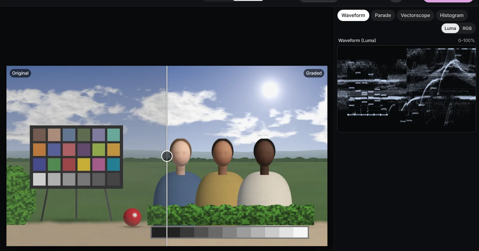 (enlarge image)
Flat original (left) and the corrected tonal range (right), with Compare on Split.
Protect the extremes
Detail lost at either end of the range cannot be brought back later in the grade, and compression makes it worse: a crushed shadow turns into blocky noise on a streaming service, a clipped sky into a flat white shape. Three checks catch most problems:
- Clipping view: red stripes where any channel is at 100%, blue where all are at 0, yellow where one channel has crushed inside a colour. A saturated red jacket can clip its red channel while the luma waveform looks fine.
- False colour: large purple areas mean crushed blacks, large red areas clipped whites.
- Histogram: a tall spike pressed against either edge confirms many pixels are piling up there.
If the lightest tones are close to the edge, a small negative Highlights move usually rescues them without making the shot look grey. For log footage, the Footage panel’s Highlights option offers Soft roll-off, which eases values above white back into range instead of cutting them off.
Contrast changes colour too
Every contrast control here works on red, green and blue alike, which spreads the channels of a coloured pixel apart and so raises saturation. That is often welcome, but it means you should set tone before judging colour. When you want contrast without the extra saturation, use the Luma curve, covered in curves. A deliberately lifted, milky black is a style rather than a fault: Faded film in Creative does it cleanly, and the film look page shows it in context.
Set contrast and tonal range on a flat clip
Stretch a flat clip to a full tonal range, place mid grey and add contrast while watching the waveform and false colour.
- 1
Open the clip with the scopes
Choose Open video or photo, switch to Pro, and show Waveform and Histogram in the Scopes column.
- 2
Set the end points
In Adjust, lower Blacks until the bottom of the waveform touches 0-2%, then raise Whites until the lightest true white sits near 95-100%.
- 3
Place mid grey
Open View and choose False colour. Nudge Exposure until a grey card, or the middle of the scene, turns green (41-48%).
- 4
Shape the contrast
Return View to Normal and raise Contrast. For a precise stretch, use Contrast and Pivot in Wheels instead.
- 5
Protect the extremes and compare
Check Clipping for red or blue stripes, ease Highlights or Shadows if needed, then set Compare to Split to see the difference.
Drop a video or photo to colour gradeChoose a video or photo to grade
Opens in the studio: looks and Auto colour for a quick result, wheels, curves, masks and scopes when you want more.It opens in the studio on your phone. Nothing is uploaded.
MP4, MOV, WebM, MKV, JPG, PNG, WebP
Free · no watermark · graded on your device, never uploaded