Chapter 9 of 13 · Advanced · 8 min read
Creative Color Grading: How to Build a Look
A look is the part of a grade that is a choice rather than a fix. Correction makes the picture accurate; the look makes it feel like something: a summer memory, a cold thriller, a faded photograph. The best looks are built from a handful of simple moves, each with a reason, applied to footage that has already been corrected.
This chapter takes the classic looks apart so you can build your own: teal and orange, film emulation, split toning, bleach bypass and black and white, plus the finishing touches and the restraint that separates a graded film from a filter. If you want a finished cinematic look in one click, the cinematic colour grading page has a library of them; this is about how they are made.
Video guide
Build a Creative Color Grading Look: Teal, Film and Grain
Chapters
Build the look on a correction
A look is a transformation, and a transformation gives predictable results only on predictable input. If one shot is too warm and another too cool, the same look turns the first orange and the second grey. So correct first: balance white, set the black and white points, check skin (see colour correction and contrast and tonal range). Then build the look.
The studio keeps the two apart. In Layers, Correction sits above Look, and layers apply from top to bottom. Auto colour and Adjust write into Correction by default; looks from the library go on Look. To build a look by hand in Pro, select Look in Layers first, then use Wheels, Curves and Creative: the Editing: chip should read Editing: Look. Now you can change the correction shot by shot and keep the look identical, which is how a sequence stays consistent (see shot matching).
Teal and orange: complementary contrast
Colours opposite each other on the colour wheel are complementary, and placing them side by side gives the strongest contrast of hue. Skin sits between red and yellow, and its opposite is a blue-green: teal. Push the surroundings towards teal and keep faces warm, and people separate from the background even when both are equally lit. Real scenes help: shadows outdoors are lit by blue sky, practical lights are warm.
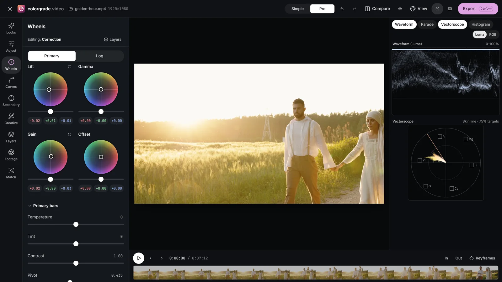
- On the Look layer, open Wheels and drag Lift slightly towards teal, around 190-200° on the wheel. Most of the look comes from cooling the shadows.
- Drag Gain a little towards orange, around 30-40°. Keep it smaller than the teal push.
- Or use Split toning in Creative: a teal Shadow tint, an orange Highlight tint, and Balance to move the point where one hands over to the other.
- In Looks, raise Protect skin tones. Skin is already on the warm side, so the orange push moves it furthest, and any teal that reaches the midtones drains it.
 (enlarge image)
On the Look layer: Lift towards teal, Gain slightly towards orange.
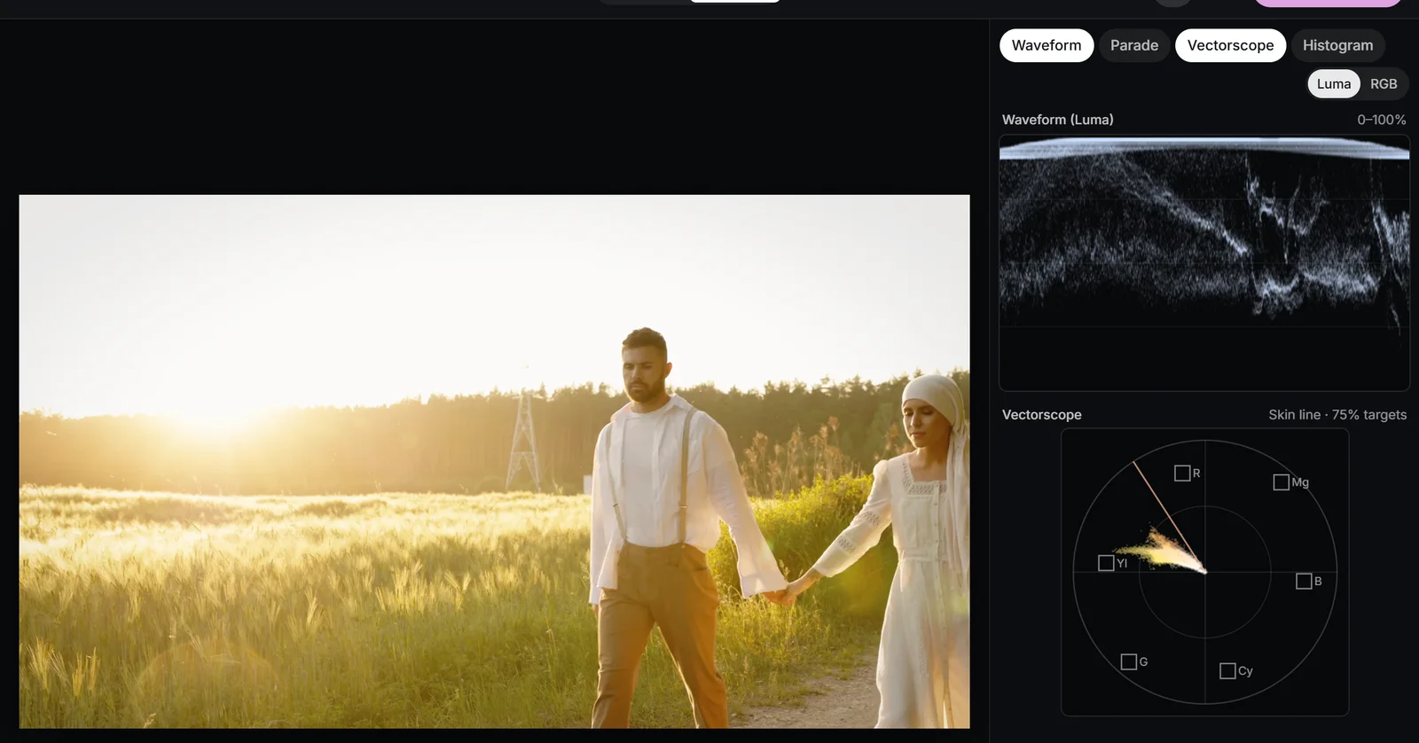
Watch the Vectorscope as you go: the background trace should lean towards cyan and blue, the skin cluster should stay on the skin tone line (more on skin). If foliage turns turquoise, pull the Green band’s Hue back towards yellow in Curves, HSL.
Film emulation: toe, shoulder and crossover
What people recognise as a film look is mostly the shape of the contrast. Film negative and print stock respond to light in an S-shape: a toe where shadows roll gently into black rather than stopping dead, a straight middle, and a shoulder where highlights compress smoothly instead of clipping. Digital video, by contrast, is straight until it hits a hard ceiling.
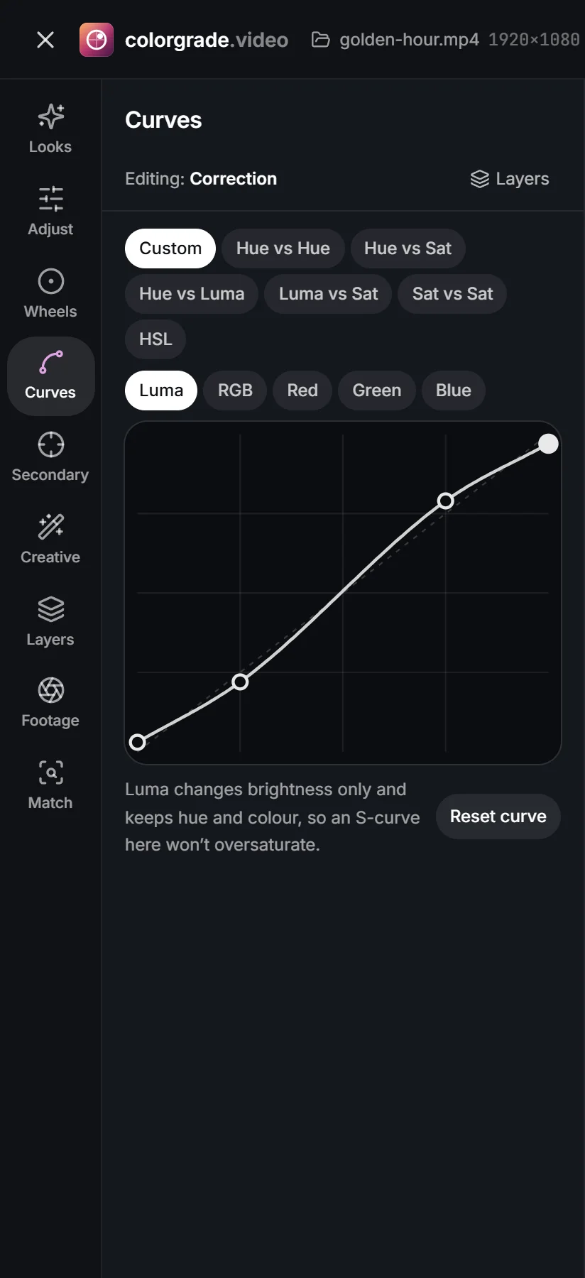
- Contrast shape. In Curves, Custom, add a gentle S: pull a point at a quarter down a little and push a point at three quarters up. Lift the black end point slightly for a softer toe, and pull the white end point down a touch for a shoulder.
- Colour crossover. In film, the three dye layers don’t respond identically, so colour shifts with brightness: shadows a little cool or green, highlights a little warm. Recreate it with a small bend in the Blue curve, raised at the bottom and lowered at the top, so the channel curves cross.
- Saturation roll-off. Film rarely reproduces neon-pure colour. A negative Colour boost in Wheels calms only the most saturated colours.
- Faded film lifts the blacks into a matte, like a print that has aged or been printed light.
 (enlarge image)
A film-style curve: lifted toe, gentle S, rolled-off shoulder.
Texture: grain and halation
Grain adds the moving texture of the silver crystals, with Grain size and Grain roughness to choose between fine 35mm and coarse 16mm; it changes 24 times a second, as film grain does. Halation is the red-orange glow film produces round bright light, when light passes through the emulsion, reflects off the back of the film and re-exposes the red-sensitive layer. A touch of it round a sunlit rim or a lamp is one of the most convincing film cues. Bloom is a softer, neutral glow. The film look page covers stocks and gauges in more detail; the 35mm Release Print look is a good one to take apart.
Split toning and bleach bypass
Split toning tints shadows and highlights separately. Complementary pairs, such as teal and amber, give energy and separation; neighbouring hues, such as gold highlights over brown shadows, give harmony and a nostalgic feel. Keep the amounts low: a split tone should be felt in whites and greys rather than seen on skin.
Bleach bypass comes from a lab process in which the bleach step is skipped, leaving silver in the film alongside the colour dyes. The result is a black and white image laid over a colour one: lower saturation, harder contrast, deep blacks and a metallic sheen in the highlights. To build it, lower Saturation by about 35-45, raise Contrast by 25-35, add a firm S-curve and a little Grain. Skin goes pale and hard, which is the point; it suits war, crime and industrial settings. The Bleach Bypass look in All looks is a starting point.
Black and white with a channel mix
Turning saturation to zero gives a flat, lifeless monochrome, because colours that contrast strongly, such as a red jacket on green grass, often have similar luminance and turn the same grey. Black and white photographers solved this with coloured filters on the lens, and the Black and white section in Creative does the same with a Red, Green and Blue channel mix.
| Weight towards | Like a | Effect |
|---|---|---|
| Red | Red filter | Blue sky deepens, clouds pop, skin smooths and lightens |
| Green | Green filter | Foliage lightens, skin gains texture and depth |
| Blue | Blue filter | Haze and mood, skin blemishes stand out |
If the picture gets lighter or darker overall as you change the mix, rebalance the three so the total stays about the same. Add contrast and fine grain afterwards. The black and white video page has ready-made versions, including Mono Red Filter.
Vignette, soft focus and restraint
Vignette in Creative darkens (negative Amount) or lightens the edges, with Midpoint setting how far in it reaches, Roundness its shape and Feather its softness. A good vignette is one nobody notices: it simply guides the eye towards the centre. If you can see the ring, halve it. For an off-centre subject, use an inverted window on a secondary layer instead (secondary correction). Soft focus adds diffusion, the glow of a diffusion filter, that lowers local contrast round highlights; a little flatters faces, a lot looks like a dream sequence.
Then pull everything back. A look built at full strength while you stare at one frame for ten minutes nearly always ends up too strong. For a library look, lower Intensity; for one built by hand, lower the Look layer’s Opacity in Layers. Around 60-80% is common. Press Bypass after a break to see it fresh, and check skin on the Vectorscope one last time.
 (enlarge image)
The finished look on the Vectorscope: cool background, skin still on the line.
Saving a look and exporting it as a .cube
Save as my look (Shift+S) in Looks stores the look in this browser, under My looks in All looks, ready for the next clip. To carry a whole grade, correction included, to another clip in the same session, use Copy grade and Paste grade in Match.
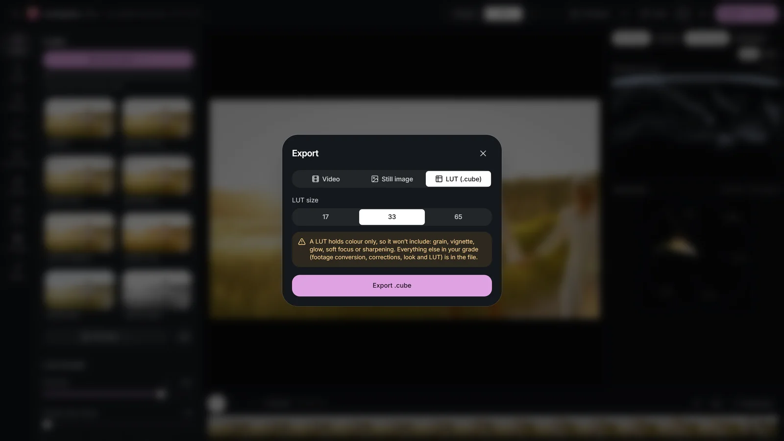
To use the look in Premiere Pro, DaVinci Resolve, Final Cut Pro or CapCut, open Export, choose LUT (.cube), pick a LUT size of 33 or 65 and choose Export .cube (Shift+L). A LUT carries colour only, so the export warns if the grade includes grain, a vignette, glow, sharpening, masked layers or keyframes; recreate those in the other application. Apply the .cube there to footage corrected the same way, because like any creative LUT it expects balanced input (how LUTs work).
 (enlarge image)
Export .cube saves the colour of the look and warns about what a LUT can’t hold.
Try it: build a look from scratch
Correct a clip, then build a teal and orange film look on the Look layer with wheels, a curve and grain, protect the skin, and pull it back with Opacity.
- 1
Correct first
Open the clip, switch to Pro and press Auto colour. Check that greys are neutral on the Parade.
- 2
Select the Look layer
In Layers, select Look. The Editing: chip now reads Editing: Look.
- 3
Add complementary colour
In Wheels, drag Lift a little towards teal and Gain a little towards orange, then raise Protect skin tones in Looks to about 70%.
- 4
Shape and texture
In Curves, Custom, add a gentle S with a lifted black point. In Creative, add some Grain and a touch of Halation.
- 5
Hold back and save
Lower the Look layer’s Opacity to about 75%, compare with Bypass, then choose Save as my look or export it from LUT (.cube).
Drop a video or photo to colour gradeChoose a video or photo to grade
Opens in the studio: looks and Auto colour for a quick result, wheels, curves, masks and scopes when you want more.It opens in the studio on your phone. Nothing is uploaded.
MP4, MOV, WebM, MKV, JPG, PNG, WebP
Free · no watermark · graded on your device, never uploaded