Chapter 5 of 13 · Intermediate · 8 min read
Curves in Color Grading
A curve is the most flexible control in a grade. The sliders in Adjust and the wheels each change the picture in one fixed shape; a curve lets you draw the shape yourself, adding contrast in exactly the range you want, cooling only the deepest shadows or leaving one tone untouched while the rest moves.
The studio’s Curves panel has two families. The Custom curves remap level, either for all three channels together, for luma alone or for red, green and blue separately. The hue curves select by colour instead: Hue vs Hue, Hue vs Sat, Hue vs Luma, Luma vs Sat and Sat vs Sat change one range of colours and leave the rest. This chapter covers both, with real uses on landscape-sky, a landscape with blue sky and greenery, and ends with the HSL tab, the quicker cousin of the hue curves.
Video guide
Color Grading Curves: Luma vs RGB S-Curve and Hue vs Sat Sky
Chapters
How a curve works
A Custom curve plots input level along the bottom, from black on the left to white on the right, and output level up the side. With no change it is a straight diagonal: every input comes out as itself. Click to add a point, drag it to move, double-click a point to remove it, and Reset curve returns to the diagonal. The black and white end points can be moved too, which sets the black and white points directly.
Read a curve by its slope as well as its position. Where the curve is steeper than the diagonal, tones in that range are spread apart and gain contrast; where it is flatter, they are squeezed together and lose it. That is why every curve is a trade: contrast gained in one range is taken from another.
The studio draws smooth, shape-preserving curves that never overshoot between points. In practice that means a point can’t make a neighbouring range bend the wrong way, and curves never fold back on themselves, the cause of the posterised, solarised look some editors produce when points are placed close together.
S-curves: contrast you can shape
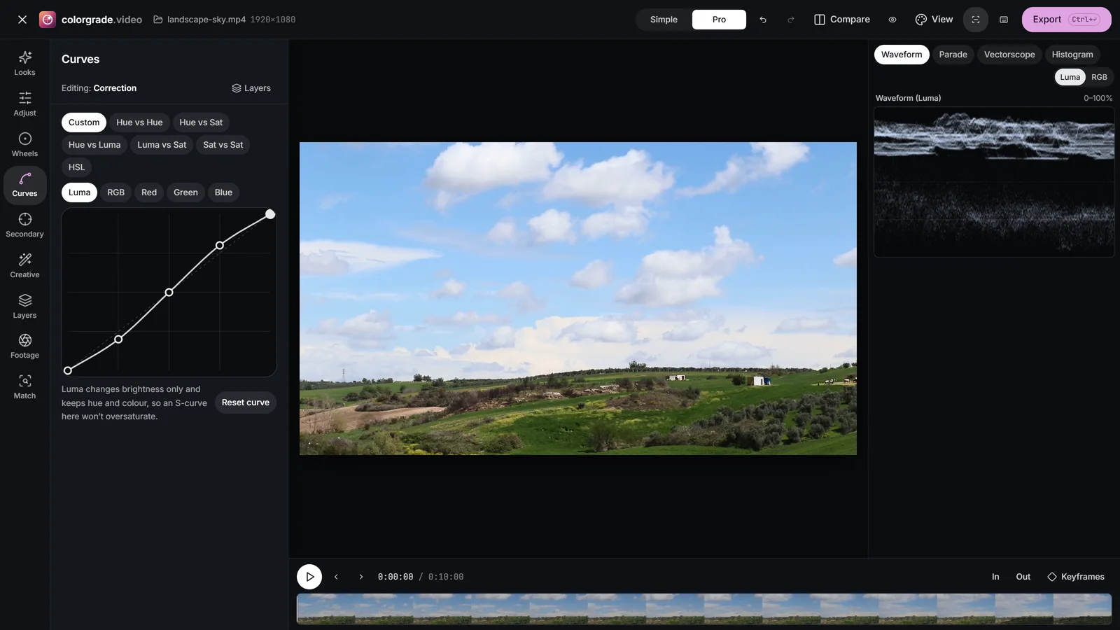
The classic contrast curve is an S. Pull a point at about a quarter of the way along down a little and push a point at about three-quarters up a little: the midtones get steeper, so they gain contrast, while the two ends flatten so shadows and the lightest tones roll gently into black and white instead of clipping. Add a third point in the middle, on the diagonal, to stop mid grey moving.
- Place the steepest part of the S where the subject’s tones are. On a face lit at about 50%, centre the S there and the face gains shape.
- An inverse S, flatter in the middle, softens a harsh, contrasty shot.
- Raising the black end point of the curve gives the lifted, matte black of a film look; lowering the white end point dulls the top end for a vintage feel.
The Contrast slider applies a fixed S around mid grey; a curve lets you choose where the S sits and how far each half bends. For the tonal groundwork that comes before it, see contrast and tonal range.
 (enlarge image)
A gentle S-curve on Luma adds contrast without louder colour.
The luma curve vs the RGB curve
The channel buttons above the Custom curve are Luma, RGB, Red, Green and Blue. The first two look alike but behave differently, and the difference is one of the most useful things to know about curves.
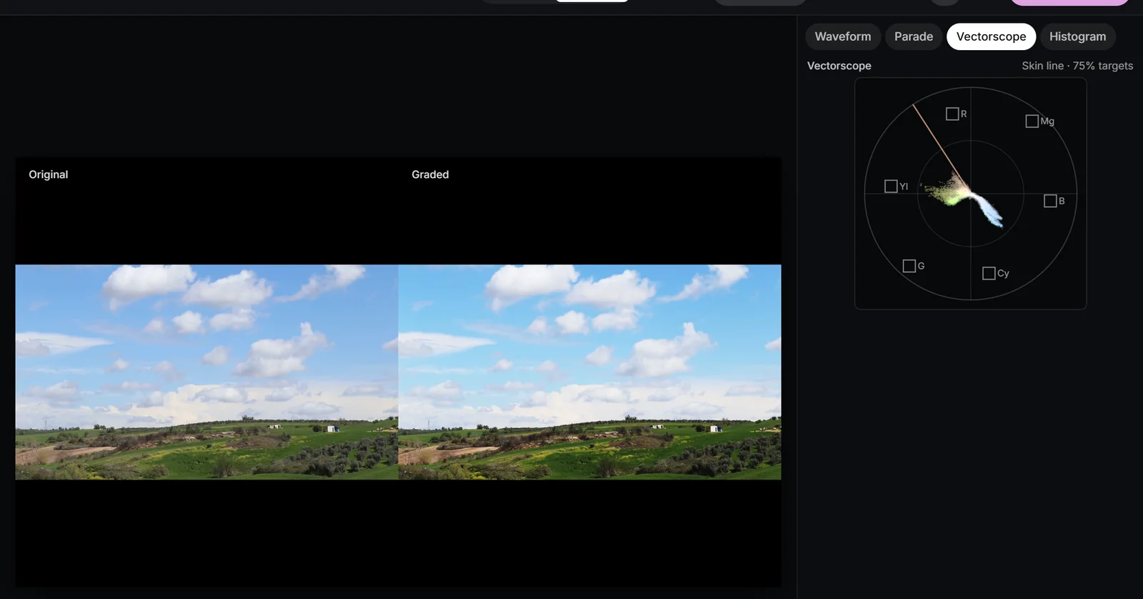
The RGB curve applies the same curve to red, green and blue. For a grey pixel that only changes level. For a coloured pixel, whose three channels sit at different levels, a steep part of the curve pushes the channels further apart, so an S-curve on RGB adds saturation along with contrast, and can nudge hues slightly too. On landscape-sky, an RGB S-curve makes the grass and sky noticeably more vivid.
The Luma curve changes only luma (Y, the weighted brightness). The studio works out how much the curve moves each pixel’s luma and adds that same amount to all three channels, which keeps the hue and the colour difference intact. The same S-curve on Luma adds the contrast without the extra saturation.
| You want | Use | Why |
|---|---|---|
| Punchy contrast with richer colour | RGB | Saturation rises with contrast |
| Contrast without louder colour, e.g. on skin | Luma | Colour difference is kept |
| A cast fixed only in the shadows or top end | Red, Green or Blue | One channel at chosen levels |
| A split tone without wheels | Blue (and Red) | Opposite moves at each end |
 (enlarge image)
An S-curve on RGB adds saturation as well as contrast: watch the Vectorscope.
Red, Green and Blue channel curves
The Red, Green and Blue curves change one channel at chosen levels, which makes them both a correction tool and a styling tool. Watch the Parade while you work: each curve moves exactly one of its three traces.
- Fix a cast that lives only in the shadows: if the bottom of the blue trace sits high, add a point low on the Blue curve and pull it down, with an anchor in the middle to protect the rest.
- Cool shadows, warm top end: raise the low part of the Blue curve and lower its upper part. The result is a split tone similar to cool Lift and warm Gain, but you choose exactly where the crossover falls.
- Cross-processed looks bend the channels in opposite directions, for example an S on Red and Green and an inverse S on Blue. The creative looks chapter builds looks like this.
For broad balance the wheels are quicker; reach for channel curves when a cast changes across the tonal range. The colour wheels chapter compares the two approaches.
Hue curves: change one colour without a mask
The hue curves select pixels by colour. On Hue vs Hue, Hue vs Sat and Hue vs Luma, the bottom axis runs through the hues, red, yellow, green, cyan, blue, magenta and back to red, and the flat line across the middle means no change. Raise or lower a point and only pixels of that hue respond. Pick colour adds a point at the hue you click on the picture, so you don’t have to guess where the sky’s blue sits on the axis.
Near-neutral pixels have no reliable hue, so the studio fades hue shifts and saturation boosts out as colours approach grey: clouds, white shirts and grey concrete don’t pick up stray colour.
| Curve | Selects by | Changes | Real use |
|---|---|---|---|
| Hue vs Hue | Hue | Hue, up to ±180° | Turn yellowish foliage greener |
| Hue vs Sat | Hue | Saturation, 0-2x | Deepen the sky, calm a neon sign |
| Hue vs Luma | Hue | Level, ±2 stops | Richer, deeper blue sky |
| Luma vs Sat | Level | Saturation | Desaturate the deepest shadows |
| Sat vs Sat | Saturation | Saturation | Lift muted colours, calm vivid ones |
Make the sky deeper
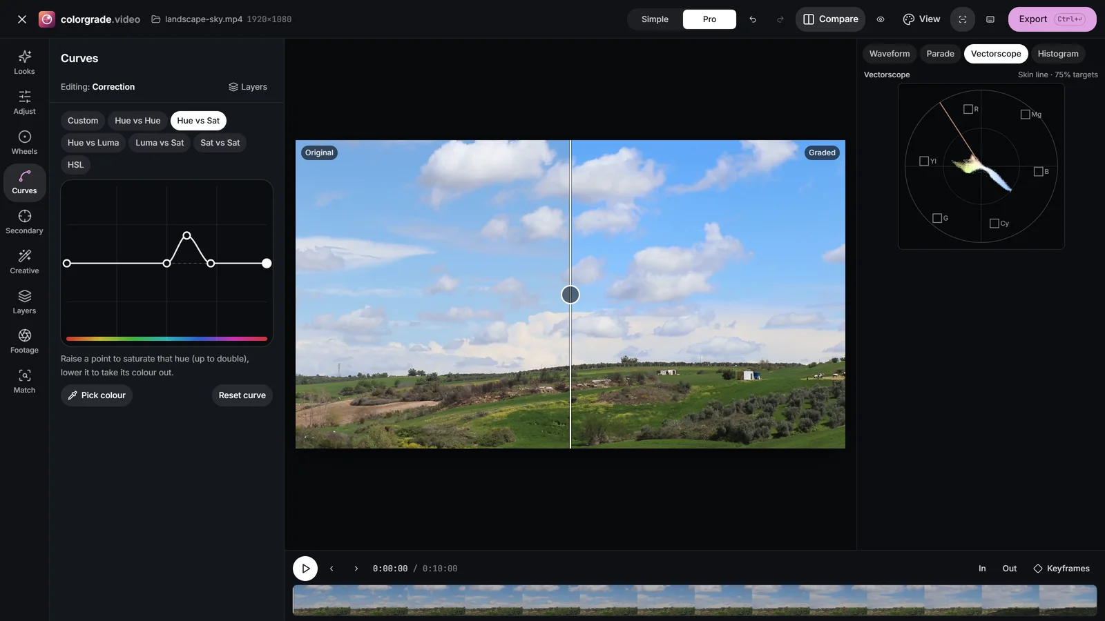
On Hue vs Sat, use Pick colour on the sky, then raise that point slightly. Add anchor points on the flat line either side, around cyan and around purple, so the change stays inside the blues. Then on Hue vs Luma, lower the blue a touch. Together they give the deeper sky that a polariser would: richer colour and a little less level, rather than the cartoon blue that saturation alone produces.
 (enlarge image)
Hue vs Sat raised at the sky’s blue, with anchors either side.
Fix green foliage
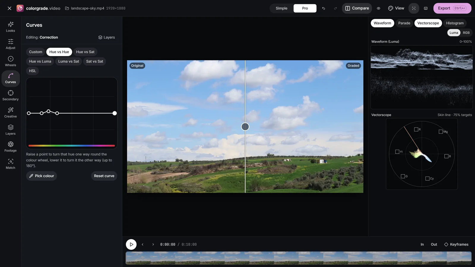
Grass and leaves often record as yellow-green, which reads as dry or unhealthy. On Hue vs Hue, put a point on the yellow-green and raise it slightly: those hues turn a few degrees towards green, while true yellows and the sky stay put. For greens that are too loud, lower the same range on Hue vs Sat instead.
 (enlarge image)
Hue vs Hue turns yellow-green foliage towards green.
Calm a neon sign, quiet the shadows
A magenta sign or a saturated LED strip can pull the eye away from the subject. A narrow dip on Hue vs Sat at its hue calms it without touching skin. Luma vs Sat works on level instead of hue: lowering its left end desaturates the deepest shadows, which hides colour noise and gives cleaner blacks, and lowering its right end gives the gentle desaturation of the lightest tones that film shows. Sat vs Sat scales saturation by how saturated a colour already is, so raising its left half brings life to muted colours without pushing vivid ones over the edge.
The HSL tab, and when to use a qualifier instead
HSL offers the same idea with fixed bands: Red, Orange, Yellow, Green, Aqua, Blue, Purple and Magenta, each with Hue, Saturation and Luminance sliders. It is faster than drawing hue curves, and the bands cover the common jobs: Blue for skies, Green and Yellow for foliage, Orange for skin. Keep only this colour turns everything else monochrome for a colour-splash effect, and Reset HSL clears all bands. To recolour an object outright, the change a colour in a video page shows the quickest route.
Choose hue curves when the colour you want falls between two bands or needs a narrower range; choose HSL for speed. And when the colour you want to change is shared by something you want to keep, a blue shirt under a blue sky, or skin and a wooden table, no hue-based control can tell them apart. That is the job of a qualifier and a power window on their own layer, covered in secondary colour correction.
Grade a landscape with curves
Add contrast with a luma S-curve, deepen the sky with Hue vs Sat and Hue vs Luma, and fix the greens with Hue vs Hue.
- 1
Open the clip with the scopes
Choose Open video or photo, switch to Pro, open Curves on the Custom tab, and show Waveform and Vectorscope.
- 2
Add contrast on Luma
Select Luma and draw a gentle S: a point at a quarter lowered slightly, a point at three-quarters raised slightly.
- 3
Deepen the sky
Open Hue vs Sat, use Pick colour on the sky and raise that point a little, with anchor points either side. On Hue vs Luma, lower the blue slightly.
- 4
Fix the greens
On Hue vs Hue, add a point on the yellow-green of the foliage and raise it slightly so it turns towards green.
- 5
Quiet the shadows and compare
On Luma vs Sat, lower the left end of the curve to desaturate the deepest shadows, then set Compare to Split.
Drop a video or photo to colour gradeChoose a video or photo to grade
Opens in the studio: looks and Auto colour for a quick result, wheels, curves, masks and scopes when you want more.It opens in the studio on your phone. Nothing is uploaded.
MP4, MOV, WebM, MKV, JPG, PNG, WebP
Free · no watermark · graded on your device, never uploaded